What is the problem?
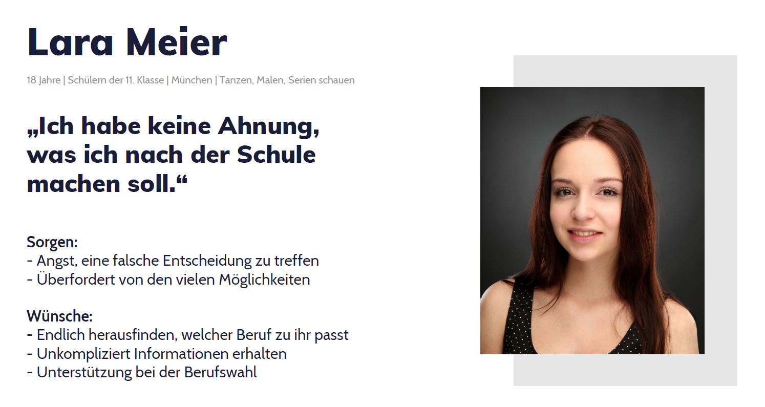
"There are so many people who do not know what to do with their lives. I think most of them are more like me, they have no idea. I can't imagine what I should do after school."
This is a sentence from an 18 years old high school student I interviewed for this project. And she is not the only one. For many students nowadays it is very difficult to choose a profession or a field of study among the huge range of possibilities.
And that is no wonder, since in Germany alone there are over
300
training programs
20,000
courses of study
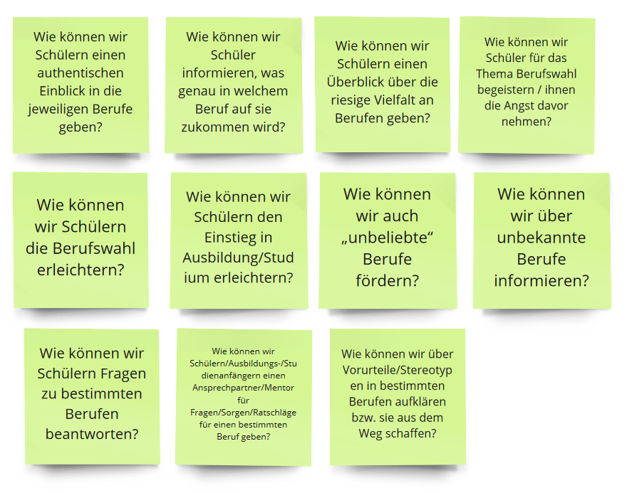
So how might we...
- make the choice of career easier?
- give an overview of the huge variety of professions?
- help students find out what suits them?
- offer detailed information & authentic insight?
- take away the fear of choosing a career & enthuse them?
How was this concept built?
Working with the user centered design process, I did some research first, looked at statistics and talked with students about their difficulties with choosing a profession or a field of further study. With help of those insights I created a persona representing the typical user of the product I was going to build.
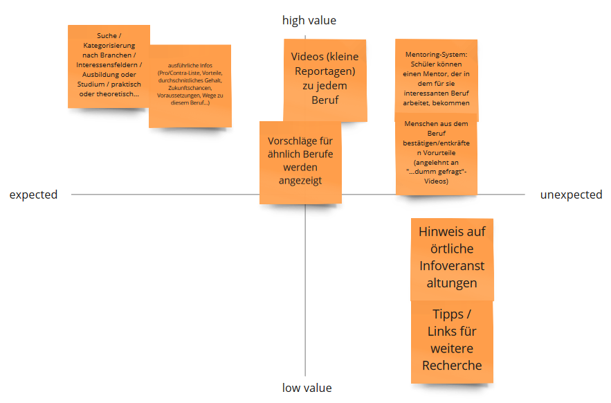
Afterwards I defined the Jobs-to-be-done, thought about possible solutions for the different issues and prioritised them in a 2x2 mapping.
Ideas with highest value for an MVP:
- Searching for specific professions and fields of study
- Detailed information about each profession (requirements, tasks, salary, future opportunities...)
- Authenitic indights (e.g. "A day in a life of..." videos, interviews of professionals...)
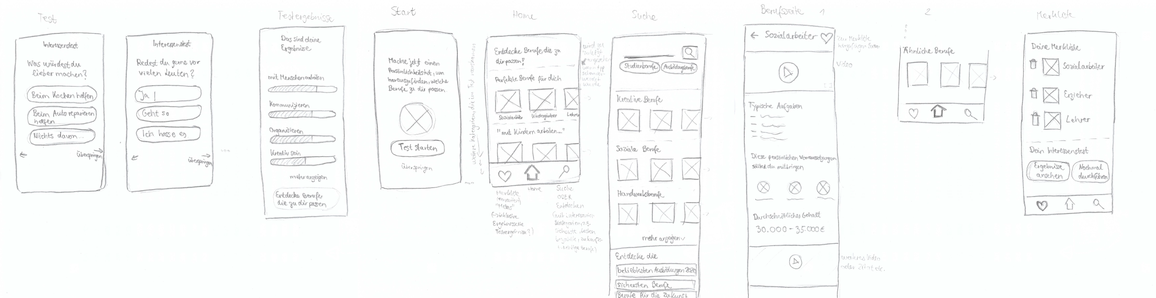
Then I started sketching and visualising my ideas with low fidelity paper prototypes.
Design
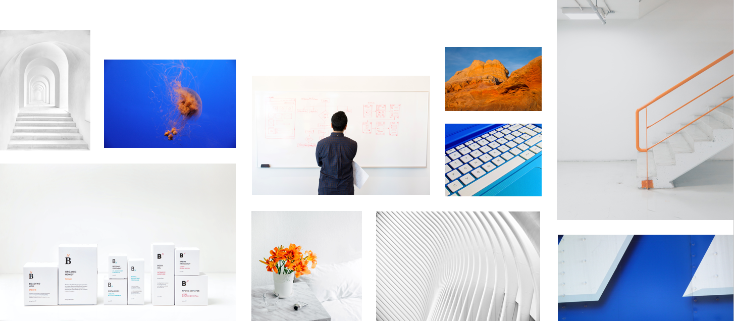
For developing a design that fits the user group and is consistent, I started with moodboards. The app should come across as modern, young but not childish, clear and informative, professional, intuitive, relaxed and inviting.
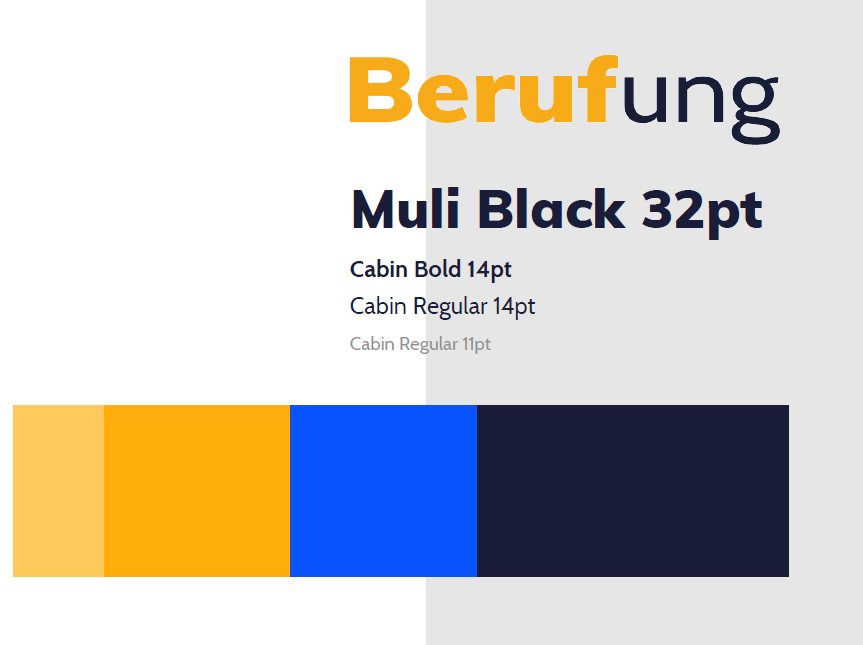
Based on this I choose final colors and fonts and created a logo. As the focus of the app lies on the extensive content, the UI should not be overloaded with too many colours and uses a lot of white. The complementary colours blue and orange build a nice contrast to this and make the app look cool and fresh. The fonts as well should not distract from the content but still look dynamic and not boring.
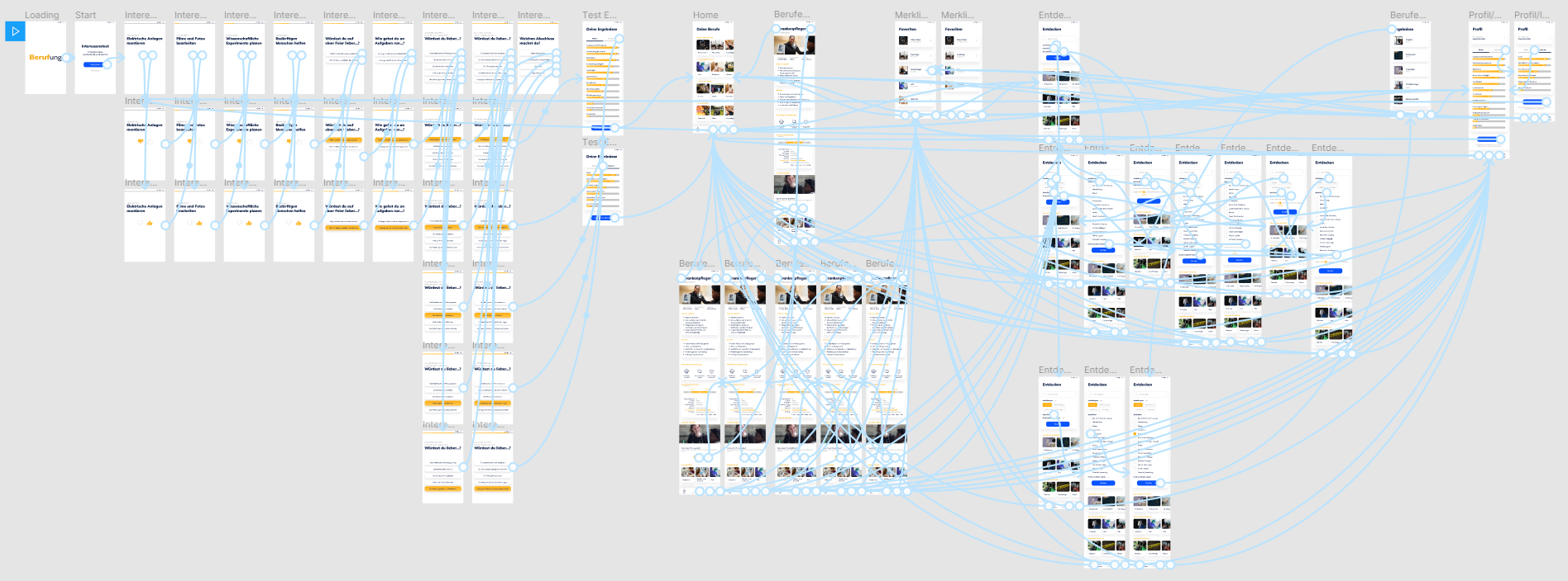
Finally I built a detailed high fidelity prototype with Figma, in oder to make exetensive user testing possible.
Testing
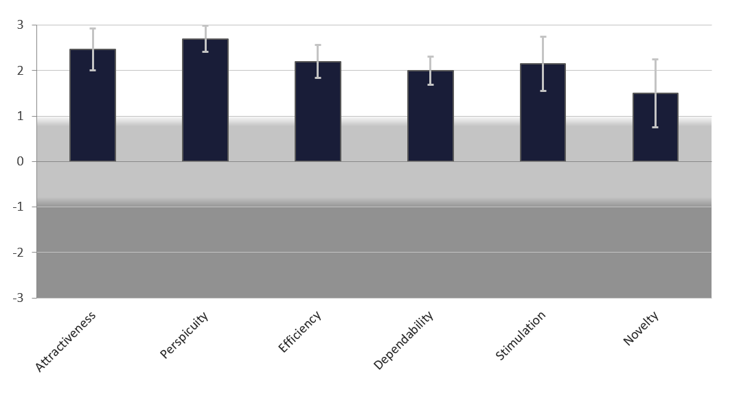
I tested the prototype with 5 persons, conducting interviews with the thinking-aloud method in order find out strengths and weaknesses regarding the structure, comprehensibility and features of the app. Afterwards I used the User Experience Questionnaire and the System Usability Scale to gain validated results about the UX and usability of my product.
The improvements of the app included:
- Querying the aspired school leaving certificate at the end of the initial test
- Changing the menu structure by adding a profile page to change the school leaving certificate and view and redo the initial test
- Adding information about the duration of training and the working hours
94.5
Total SUS Score
2.30
Pragmatic quality
1.83
Hedonic quality
Final concept and design
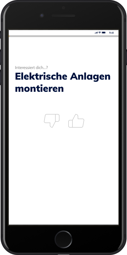
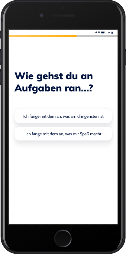
Test
- Find out interests
- Find out strengths
- Query school leaving certificate
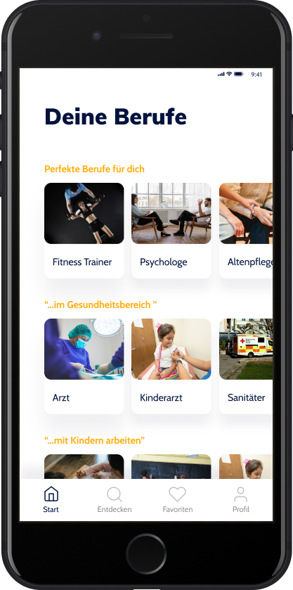
Home
- Perfect professions based on strength and interest test
- More categories with matching professions
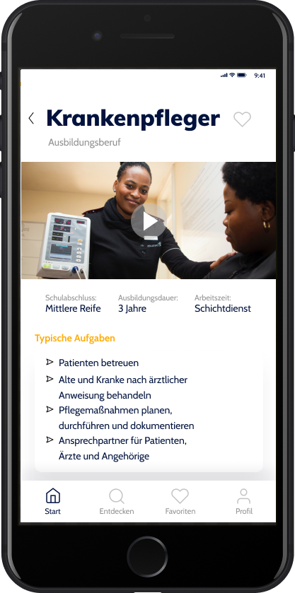
Home - Detail
- Detailed information about a profession
- video with everyday insight
- duration of training
- working hours
- typical tasks
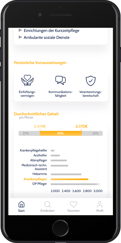
- industries
- average salary
- further info video, e.g. education about prejudices
- thumbs up or down for proposal improvement
- related professions
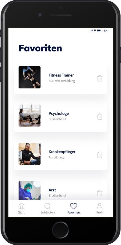
Favourites
- Save and delete favourites
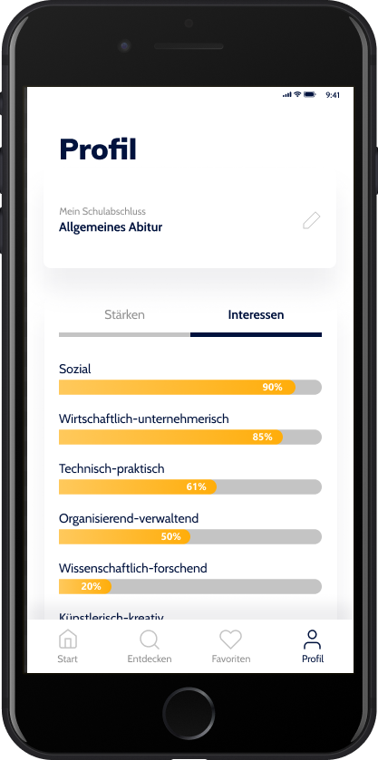
Profile
- Change school leaving certificate
- View test results
- Repeat test
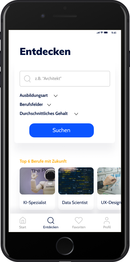
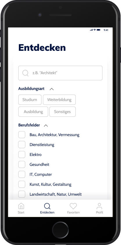
Discover
- Search
- Filter by training type, occupational fields, salary
- Interesting lists, e.g. unusual professions,
Outlook
Future features could include:
- Asking questions to professionals
- Mentoring system
- Comparing professions with each other and with own test results
As there is no such offer on the german-speaking market yet that combines all the features of Berufung and there was a lot of positive feedback in my user test, this app has a high potential to become a successful tool for students and all those who are not sure yet what to do with their lives.
"I would definitely have used such an app and I would use it now."
"I think it's a pity that the app doesn't really work yet."
"I would have found the app pretty cool if I had been a student, because I didn't know what I wanted to do."