What the Foodji app is about
The Foodji app allows users to reserve food for up to 6 hours and pick it up from smart vending machines located at their workplace. When I joined the company, the app's user interface had not been updated in a long time. To address this, I conducted a user study to test the app's key pages and flows, aiming to identify the most urgent usability and UX issues.
Essential insights from the user study
Five first-time users, representative of the app's target audience, participated in a 45-minute in-house study.
In Germany over the half of the population thinks that there are not enough opportunities for participation in politics beyond the elections and nearly 75% agree that politicians do not care about their worries (http://library.fes.de/pdf-files/fes/15621-20190822.pdf). So there is definitely a need for something that brings people closer to politics again and helps them participate and on the other hand supports politicians in understanding what the citizens really think and wish. The app myOpinion wants to offer exactly that.
User Flow
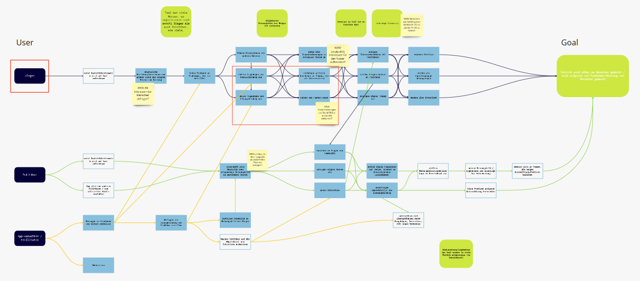
First we started building the user flow of the three different user groups of our app - the citizens, the politicians and the app administrators. Our focus was on the citizens who should be able to:
- inform themselves about relevant topics that they are interested in with focus also on local events and politics
- fill out questionnaires about certain topics
These questionnaires are created or commissioned by politicians who - with the help of the questionnaire results - can get a deeper insight in the citizens´ opinions and make decisions based on that.
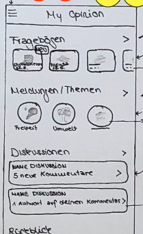
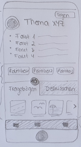
Paper Prototypes
We started scratching and paper prototyping to visualize our first ideas for the information architecture and features of the app. On the home screen users see available questionnaires and news about topics that they have previously chosen. They can take part in discussions, get an overview about what happened recently and take action by e.g. creating or signing a petition. On the topic page they have access to all the information and participation possibilities about a certain topic, including taking part in current questionnaires, seeing a timeline of what happened in the past and getting an overview about involved politicians.
User Testing
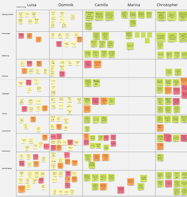
In order to test our product we conducted remote interviews with 5 users, each lasting 50-60 minutes. First we asked questions about their opinion on politics and the possibilities to participate. Then we had them perform tasks with a low-fidelity prototype of our app and asked questions about the structure and general comprehensibility.
We ordered and visualised all the interview results using the online collaboration tool Miro.
Improvements
Using the findings from user testing we identified and improved the following problems:
- Seriousness: We added information about the sources of the news, facts and questionnaires and introduced a "verified information" label.
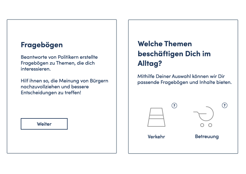
- Onboarding: We improved the onboarding process providing clear information of the functions and purpose of the app and a possibility to choose topics the user is interested in.
- Course of the questionnaire: We added the possibility to follow the progress of a questionnaire and thereby experience its impact.
UI design
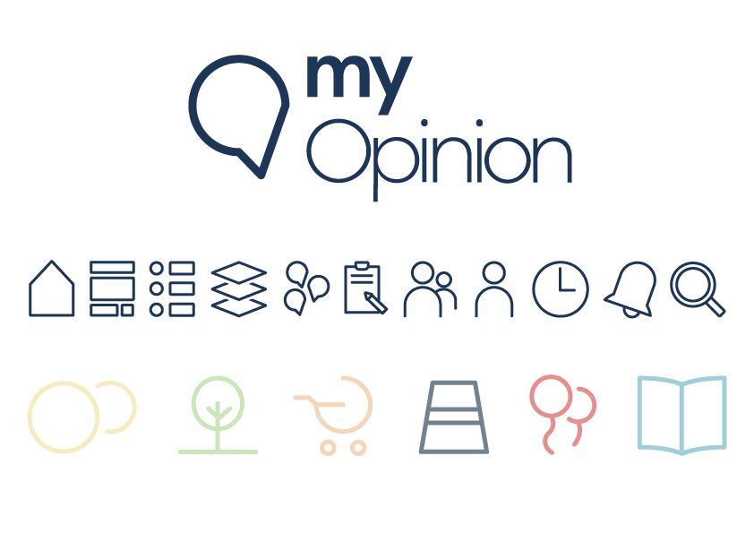
Many opinions - one app
According to this motto we chose many different light colours for the different topics and a dark blue as text and main colour. Enough white space is crucial as the users should not be distracted from the content.
The logo is a combination of a speech bubble (a metaphor for all the different opinions of people) and a check mark (standing for verified information).